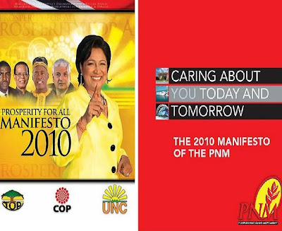
So who won the battle of the manifestos?
PLEASURE reviewed the design of both the PNM and UNC/COP manifestos, and a lot of you were clearly interested, judging from the clicks the blog picked up over the last few posts. But after the chips fell, which of the two documents came out tops, aesthetically speaking?
PNM - 3.5 out of 5 stars
I liked the PNM's attempt to be creative. I just wished it was easier to read. And, well, not so boring. It suggested stability, but was at risk of being called fartsy. Plus the selection of images was sometimes questionable. READ PNM review here.
UNC/COP - 3.5 out of five stars
In this review I found the layout pretty straightforward, almost old-fashioned, perhaps deliberately so in an effort to suggest a "back to basics" approach to governance. But sometimes, I guess, you want some innovation. And good Lord, Nigel Rojas in a moo moo? READ UNC/COP review here.
Does this suggest a dead heat for the 2010 Trinidad and Tobago general election race? Or does it mean that the country is doomed to making a choice between the pot and the kettle? Or will there be a convincing winner? Perhaps, a landslide? Hey I'm not NACTA!


